A mood-aware music interface that combines listening behavior with biometric signals.
I designed a music interface that asks not just what someone usually plays, but what state they are in right now. Biometric signals including BPM, brain wave state, pupil response, and stress level are used to shape music discovery in the moment, not after the fact.
Recommendation systems know what you played. They do not know what you needed.
Most music recommendation systems are built around past behavior. They are good at knowing what someone has listened to before, but weak at understanding why a song fits a specific moment. A user might need calm, energy, focus, or emotional recovery, but the system usually sees only skips, replays, playlists, and genre patterns.
The gap is not technical. Wearable sensors already capture BPM, brain wave state, pupil response, and stress in real time. The barrier is interface design: making emotional context visible enough for the system to respond, while keeping the experience understandable, calm, and music-first.
The system knows you listened. It does not know what you needed when you pressed play.
The design challenge was not simply to recommend better songs. It was to make emotional context visible enough for the system to respond, while keeping the interface understandable, calm, and music-first.
Four decisions that shaped the interface.
Designing a biometric music interface requires more than adding sensor data to an existing player. These four decisions changed the direction of the product.
Listening history explains taste, but it does not explain what the user needs right now. The decision was to design the system around real-time signals including BPM, brain wave state, pupil response, and stress, then connect those signals to music discovery. The product shifts from "what do you usually like?" to "what might help you right now?"
Health-like data can feel clinical or invasive if over-explained. The decision was to use simple icons, soft colors, and compact signal cards instead of dense medical dashboards. The interface needed to feel like music, not a hospital monitor. Biometric values appear as ambient context, not alerts.
Recommendation lists can feel passive and generic. The decision was to create an orbit-style discovery view where songs and artists cluster around the current track. The system becomes explorable rather than just a ranked list. A fallback list view was added after testing because some users wanted faster scanning.
New sensing logic should not force users to relearn basic playback. The decision was to keep recognizable music-player patterns: album art, play controls, bottom navigation, current track, queue, and settings. The product introduces new discovery logic while preserving familiar interaction patterns people already trust.
Two worlds: the familiarity of a music player, the sensitivity of biometric feedback.
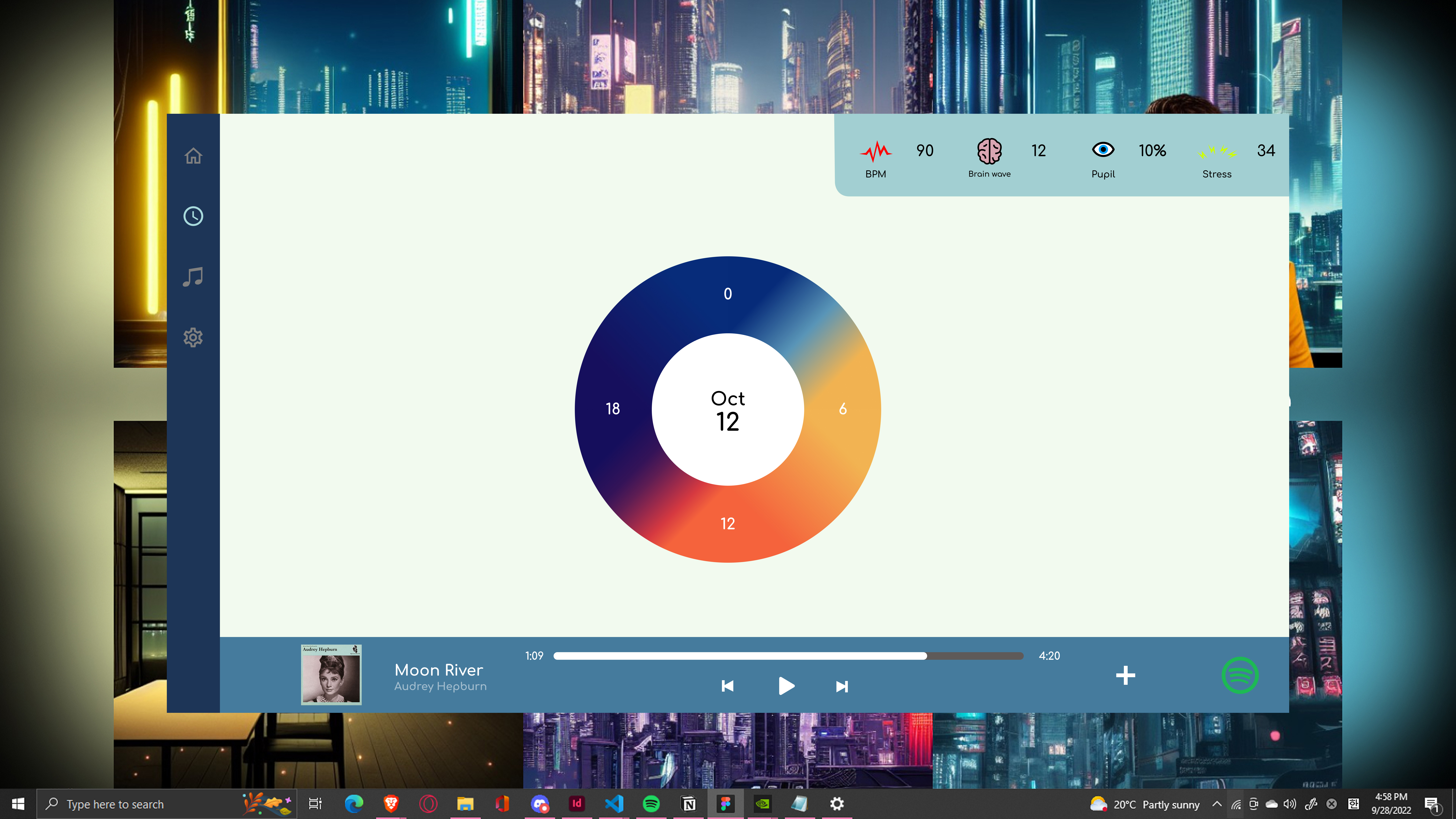
Desktop interface: biometric signal strip at the top, central player area, left navigation rail, and bottom playback bar. Signal data is ambient context, not the primary focus.
I used a soft mint surface to keep the experience calm, deep navy for navigation and structure, and bright signal colors only where biometric data needed attention. The interface had to feel like music with context, not a sensor dashboard.
From Spotify connection to mood-aware discovery.
The user begins with a familiar music account connection instead of a medical setup flow. Genre preferences and discovery count can be adjusted before any sensing begins. The product feels like a music tool from the first screen.
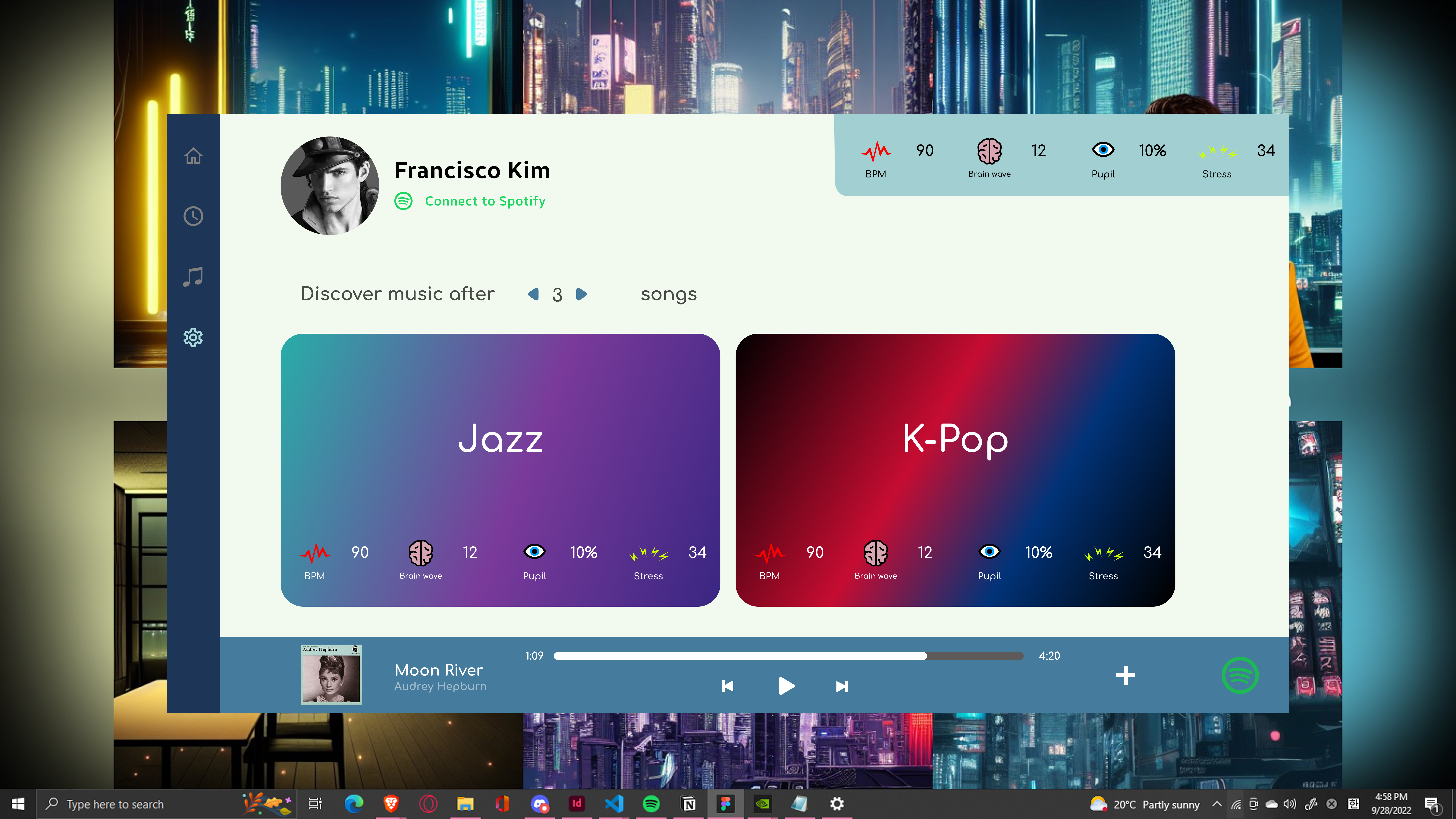
The system reads biometric signals while the user listens, including BPM, brain wave state, pupil response, and stress. The signal strip stays visible at the top of the interface without interrupting playback. Context is collected passively.
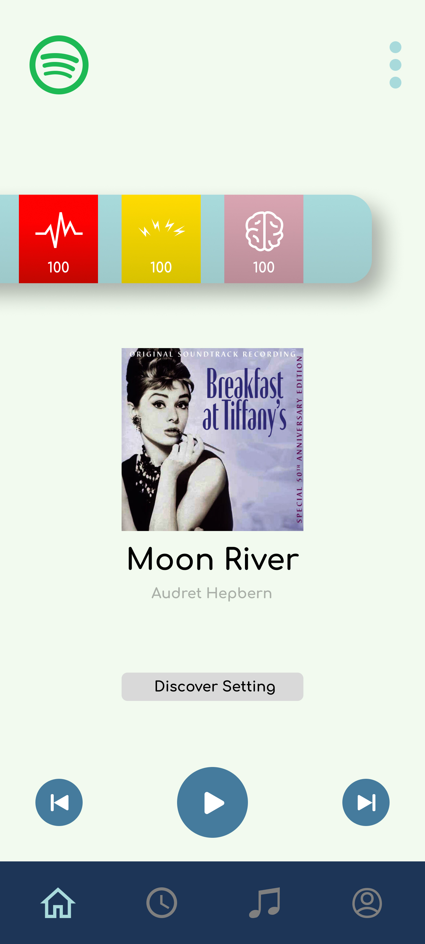
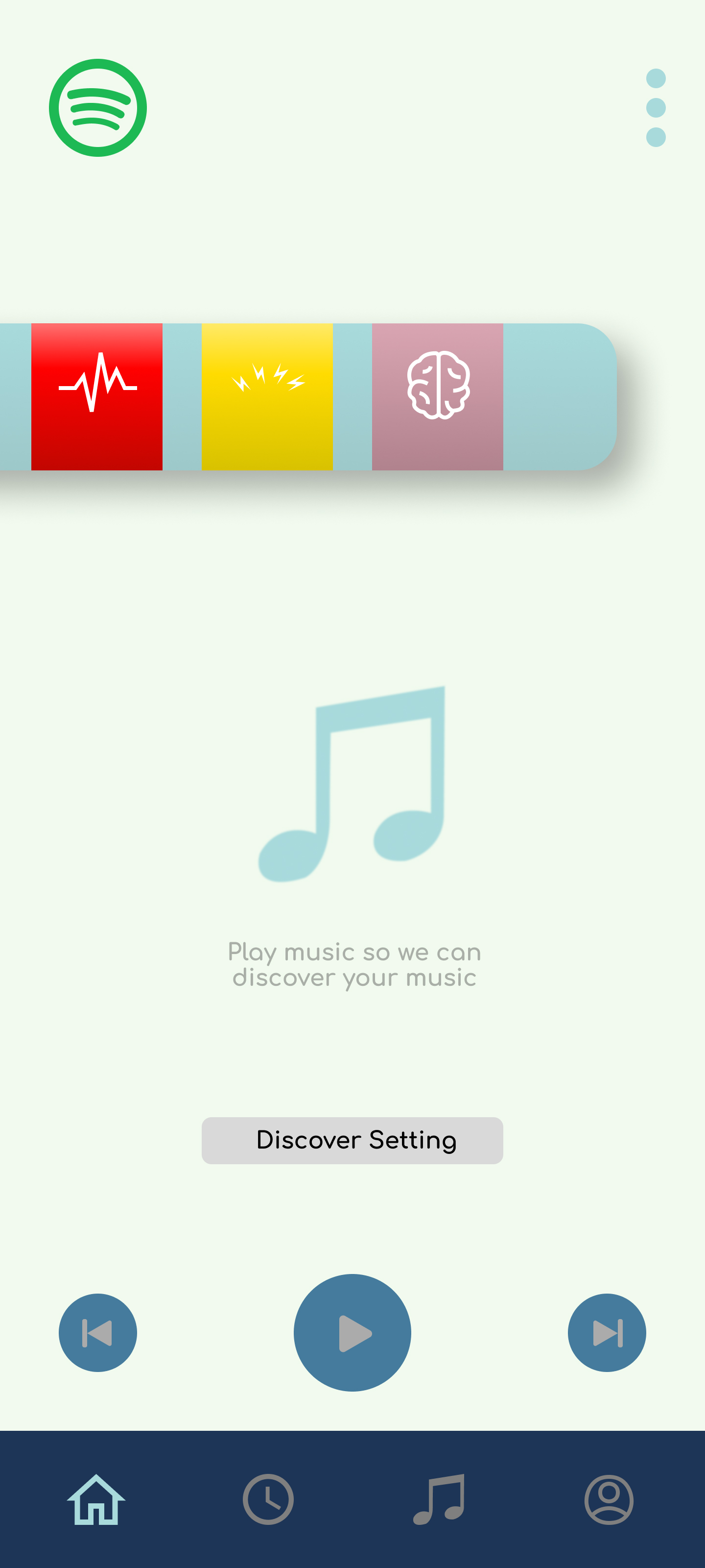
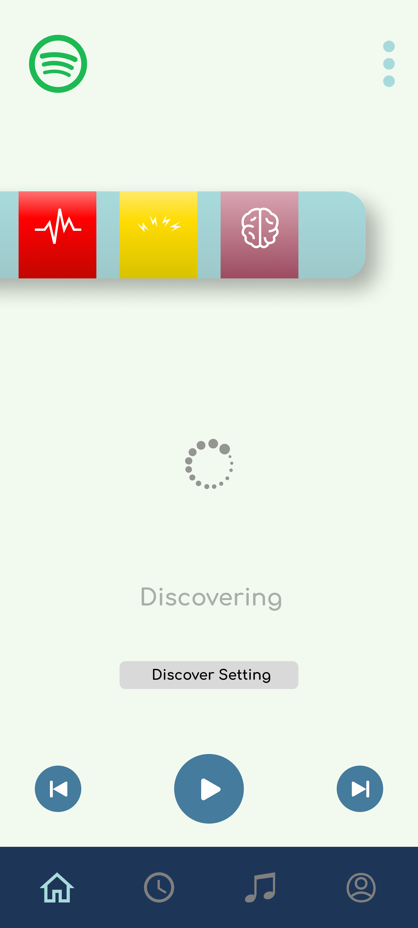
On mobile, signals appear as ambient context alongside the now-playing screen. The Discover Setting button is always accessible, so users can adjust how much the biometric layer influences recommendations at any point.
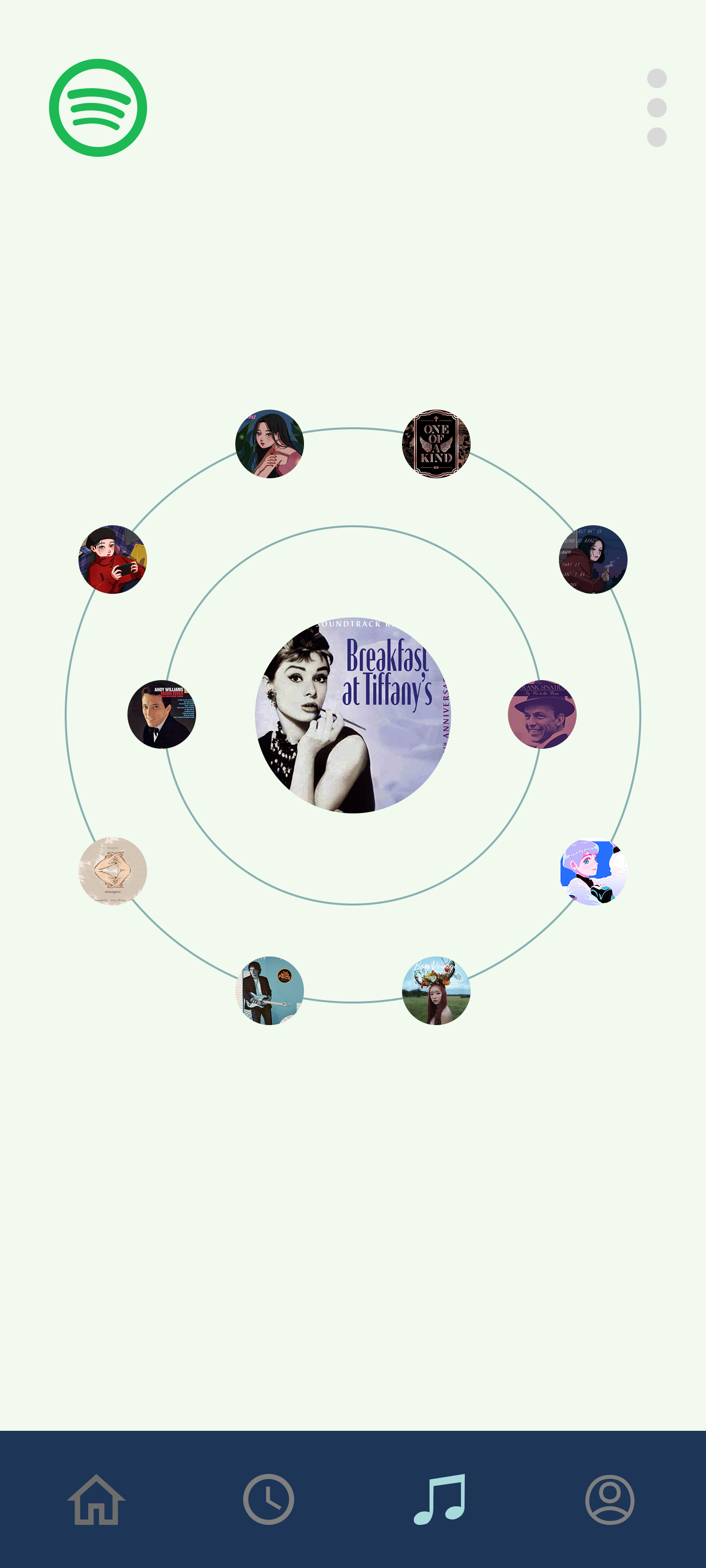
The discovery view turns recommendations into a spatial map around the current song. Tracks and artists cluster by emotional proximity rather than genre rank. The system becomes explorable, not just a list to scroll through.
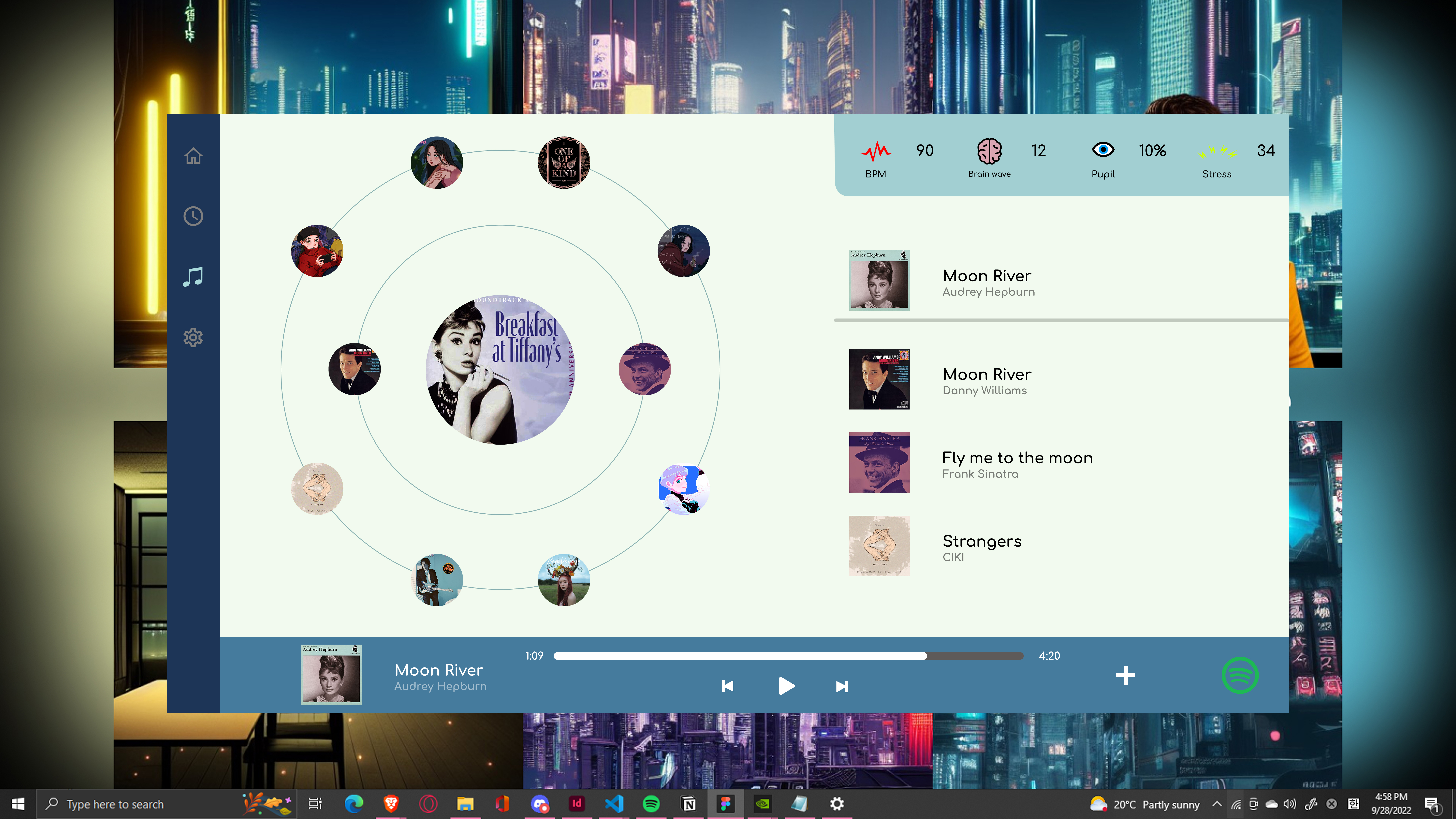
Users can switch to a queue-style view for faster scanning. Both the orbit and list formats are available without navigating away from the current track.
Users can control how many tracks to discover and what happens when signal data is unavailable. Empty and loading states are designed to feel calm rather than broken, reinforcing the music-first experience even when discovery is not active.
AI as a first pass. People reveal the rest.
AI helped identify hierarchy and clarity issues across the biometric and playback layers. Human feedback showed where biometric data felt sensitive, confusing, or too clinical for a music experience.
- Reviewed whether biometric data was readable without becoming clinical
- Checked navigation clarity across player, discovery, history, and settings
- Evaluated visual hierarchy between music content and sensor data
- Flagged possible confusion between mood signals and medical claims
- Tested empty, loading, and discovery states for clarity and appropriate feedback
- Users understood music controls faster than the biometric layer
- Sensor values needed simple labels and icons to feel approachable, not clinical
- The orbit discovery model felt more interesting than a standard recommendation list
- Users needed a fallback list view for faster scanning when orbit felt too exploratory
- The Spotify connection step needed to feel optional and low-risk, not like granting access
AI helped identify hierarchy and clarity issues, but human feedback showed where biometric data felt sensitive, confusing, or too clinical for a music experience. The emotional response to being read by a sensor required language and visual adjustments that structure review alone could not surface.
A product direction, not a launched product.
Biosensing Music demonstrates how emotional context can become a design material without overwhelming the core music experience. The strongest outcome is a product direction that connects biometric signals, familiar playback patterns, and exploratory discovery into one coherent interface.
Signal data is shown as ambient context, not a clinical dashboard. The biometric strip reads in under two seconds without interrupting playback or requiring active interpretation.
The interface introduces new sensing logic while preserving recognizable playback patterns: album art, controls, queue, and settings remain where users expect them.
The orbit view makes recommendations explorable rather than passive. Human testing confirmed it felt more interesting than a standard list, with the list view available as a fallback for faster scanning.
Biometric sensing creates real trust risks. The design process surfaced where users felt observed rather than supported, informing what a next version would need to resolve before any live sensing feature could ship.
The privacy and consent model would come first.
If I revisited this project, I would refine the privacy and consent model before any other design decision. Biosensing data can make music discovery more personal, but it also creates trust risks that the current design addresses only partially.
The next design pass would clarify what is being measured, what is stored, what stays on-device, and how users can turn signals off without losing the core music experience. The orbit discovery view and mood cards work well as a product direction. But a feature that reads biometric state needs a much clearer answer to who owns this data and where it goes before it could ship with real sensors. That answer shapes every visual and interaction decision that follows.